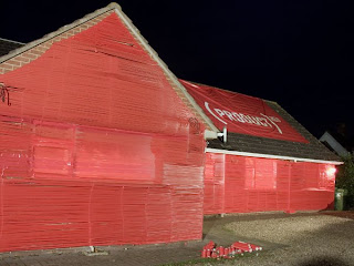
 Luke Williams: the format works really well for this piece and it doubles up as a nice object to have on your desk.
Saturday, 26 April 2008
365 Day Calendar Box.
 Luke Williams: the format works really well for this piece and it doubles up as a nice object to have on your desk.
Wednesday, 23 April 2008
Product Red Promo!!!
Balloooooons!!!!
Topshop Range!!!
Love/ Hate Drawings!!!
Don't You Want Me Baby!!!
Tuesday, 22 April 2008
Hell is...
'Red Carpet' Invitation!!!
Sunday, 20 April 2008
Book of 100 Sweets!!!
 5 Books:
smell - polo mints - hand printed with food colouring and flavoured with peppermint oil.(23 sweets)
taste - love hearts - printed on to rice paper using food colouring.(27 sweets)
hearing - black jacks - written text using letra set.(12 sweets)
touch - flyin saucers - food colouring pens written on to rice paper and bound with an actual flyin saucer sweet.(11 sweets)
sight - parma violets - printed sweets using food colouring.(27 sweets)
 Design: Warm Rain.
Client: Surgery PR
Project: Invitation.
Recipients of this invitation to a PR company's press open day instantly want to hold it up in the direction of the nearest light source. The image would become clearer when the light shines through and the transparency of the paper adds the authenticity to the x-ray effect of the hand image. It's an attractive piece that uses paper as an integral part of the design rather than just a surface image. It also encourages anyone looking at it to absorb the information from a different angle.

This simple but strong identity designed by Arizona's Ater Hours Creative for client Blue Space involves the use of die-cut square on white against blue as shown here. The only way of reading this brochure is to tear it apart from the middle. The question "what are you afraid of?" prompts the reader.This statement seems to be anti-design as it encourages the reader to violate the artwork in order to get to the content within.

 Design: Zuan Club.
Client: Arjo Wiggins.
Project: Sample.
This is die cut and folded to create the shape of a suitcase, it works well as this shape and holds a business card within it. The information given is advertising paper and the actual suitcase is made using a sample of it, therefore showing how strong the stock is an ideal for cutting and folding. This selling technique works really well when using the actual product you are advertising.
Saturday, 19 April 2008
 PRE Consultants. Project Stationery:
This concept gave the client or supplier the choice of folding an important or angry letter into an origami shape. The instructions showed through the paper so that they wouldn't be missed by its recipient of the letter. I like the fact that you are given a choice to create the origami or just to ignore it.
 'Holiday-wish-Bambi'
This is a christmas greeting card but I think that this design could work for a business card too. The 3D form is created without using any glue and is held together by simply folding it in to shape. Its also interactive so that if it were recieved through the post then you would have the joy of putting it togther to see what it created!!!
 This is quite an unusual business card as the text appears blurred and you are unable to read it. However there are no instructions in how to read it but I think the chosen material(rubber/elastic) it is printed on almost makes you want to pull at it and find out what is says. This device is clever and creates this interaction between its viewer and the card. Plus the use of media links well to the information on the card as it is advertising a personal trainer, as there are links to stretches and the pulling of muscles etc...
Subscribe to:
Comments (Atom)


