Tuesday, 25 November 2008

Evaluation for Design for Print.

1. What skills have you developed through this module and how effectively do you think you have applied them?
Firstly learning about all the printing processes available in print was useful and in doing so this allows me to take it in to consideration what methods of print to use with my work. As I hadn't really heard of print processes such as Rotogravure before and it was good to know how this method works. Also, Letter Press which was very useful as I have always wanted to learn about the press and what could be produced from such a process. I would have liked to use this method of printing with this project but I feel that it didn't really fit with what I was producing.
I also feel that I have more of an awareness for colour methods and what to take in to consideration when designing something on screen and then taking it in to print. Also it was useful to find out how much printing costs are and summing up how much it would cost to print such a product, which proved to be quite costly in some cases.
2. What approaches to generating work and solutions to problems have you developed and how have they helped?
I found that creating thumbnails for my layouts helped within the decision making on my final presentation boards. Producing small scale thumbnails for my products also provided the in this decision making also.
3. What strengths can you identify in your work and how have/will you capitalize on these?
I have looked in to the different print processes that were available for my product. Therefore allowing me to have some idea of how my designs would be produced commercially and the cost values as well. I also feel that through the use of thumbnail layout sheets i have been able to explore the design values of my product.
4. What weaknesses can you identify in your work and how could you exploit these more fully?
Firstly I feel that some of my designs could have been explored a little further and I could have experimented more with the 'food photography' side of my project(as the photography side of things didn't really work out that well) More research in to the methods of promotion in the food industry.
5. Identify five things that you will do different next time and what do you expect to gain from doing these?
  • get access to screen print earlier. Therefore I have more time to print as I ran out of time to use this printing method within this project.
  • make design decisions sooner. So that my work can move on at a pace.
  • experiment more with my designs do that I have a varied range of possible designs.
  • be more organized when it comes to printing my presentation boards as I have found out that digital print can be a very time consuming place near to a deadline!!!
  • be aware of my message I am trying to deliver and never loose track of this, as my work started to drift a little from not doing so.
6.How would you grade yourself on the following areas:
5= excellent, 4 = very good, 3 = good, 2 = average, 1 = poor

Attendance:4
Punctuality:4
Motivation:3
Commitment:3
Quantity of work produce:3
Quality of work produced:3
Contribution to the group:3


Monday, 24 November 2008

Optical Disc.


Optical Disc
2008

Printed white on A1 240gsm holographic mirri. Edition of 50 posters. The design celebrates 50 years of the optical disc whilst paying homage to Gottlieb Soland's 1957 grammo-grafik poster.

Printed by K2 screen

A Pantone Christmas!!!


A not-for-profit exploration into the colours that shape our Christmas. Frustrated at the plethora of Christmas reds, whites and greens those pesky designers at Raw Design Studio are exploring what colours people really associate with their Christmas.

This is an awesome concept for a collaborative project, getting people to have their say on what a certain pantone colour reminds them of at Christmas.lovely stuff.

Monday, 17 November 2008

PB&B Sachets Mock ups.


These sachets of crunchy/smooth peanut butter are going to be included within my DIY pack so you have the choice of either kind.
As these would be printed using the print process of flexography, this is the closest I could get to the real thing.

Sunday, 16 November 2008

more form the SHCH...


These really are amazing as there all hand drawn, I especially think the top image works really well and is quite ironic as the type portrays 'glamour' yet it is written on to toilet roll?!?!?

Sunday, 9 November 2008

Retro Business Cards.


These business cards are a great example of how well letterpress business cards can reflect you or your company. The luxurious quality of the paper combined with great design and the unique look of letterpress printing will make your business card and you stand out from everyone else.
These were created using black ink and printed on to 100% cotton paper.

Napkin Type.


SHCH graphics group:
lovely use of type all hand rendered onto napkins.

Bermuda:Samples.


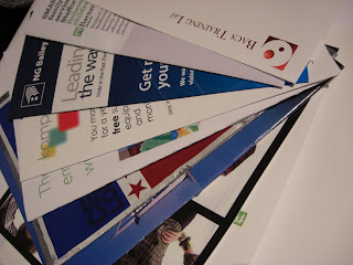
A lot of what Bermuda print are in leaflet/booklet form on various uncoated and coated stocks. Some of what they do is on a large scale in the form of posters, some can be seen in the background of the photos of the printers below.

Print Visit:Bermuda Digital Print.


On Friday I went to visit a small company called Bermuda Print and I got shown around their department. However they only specialize in digital print, but what they had to show me was all useful for the current brief and they were very happy to answer my questions. It was very informative to be shown the process of print especially on such a large scale in some cases. They also gave me a bunch of samples to take away which was very good of them.

Friday, 7 November 2008

screen print induction.


Two colour screen prints:
This was quite a useful refresher to screen print since I hadn't printed in a while. It was an interesting image we had to use and we experimented with the registration of the type to offset the image, it had quite a nice effect.

LETTERPRESS!!!

Yeyy finally got to do letterpress!!!Always wanted to know how this process worked and now I had the chance.
To create the above type I chose to use 18pt Clarendon Bold and 23pt leading.
Things to remember:
  • make sure all the notches on each letter are facing upwards so that the type reads correctly when printed.
  • use middles for the spaces between words.
  • use thins for the spacing between punctuation.
  • quads are used as padding to fill the gaps.
  • also when creating the said type start from left to right making sure that the type is arranged backwards so that it will be printed correctly.
I will definitely try to use this process again at some point?!?!?

Monday, 3 November 2008

The process of printing book.


A BOOK OUTLINING THE PHILOSOPHY AND WORKING METHODS OF PRINTING COMPANY TEAM, AS WELL AS DEMONSTRATING THE USE OF INKS, FOILS AND FINISHES IN MULTIPLE PRINTING COMBINATION'S.
CONTAINS 64 PAGES, 24 WITH COLOUR DIAGRAMS. OFFSET LITHO 15 COLOURS PLUS FOIL BLOCKING, EMBOSSING, DIE CUTTING AND UV VARNISHING.